
Creating the BuschKraft Logo

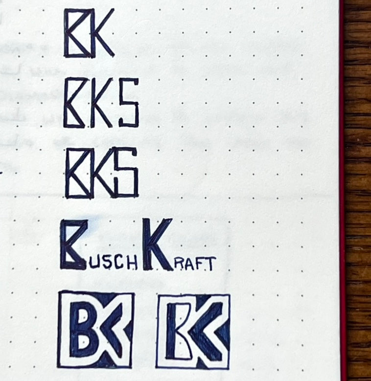
Choosing to begin BuschKraft is more than choosing to create a business or website. It’s more akin to beginning a new era or pursuing a new degree. BuschKraft will and already represents more than a brand, it’s an outlet for ideas and creative ventures. Its scope and purpose will continue to unfold, but a nice place to begin is the logo itself. I had an idea of what I wanted BuschKraft to look like, but it was kind of like something you’d see in your peripheral vision- it’s there but you can’t quite get it into focus. Much of my pottery designs and drawings have always incorporated intricate geometric lines, symbols, and embellishments. How can I represent that aesthetic and capture what BK looks like at the same time. I opted for BK because there are advantages to creating a logo that is somewhat square, and simple enough to repurpose in different contexts. BK is also our dog Bodhi Kai’s initials. Just with any other idea, I begin sketching rough outlines of what comes to mind. Different ways to connect a B and K, different styles of lines, all while trying to contain the shape within a square boundary and making it feel balanced.
 |
|
Bodhi Kai |
First Drafts
|
|
|
|
|
Started with basic stick outlines |
Different ways to connect B and K |


Marking the one that stood out and felt right
Precision Krafted
It took about a week of doodling and refining, giving plenty of thought to how I wanted the brand to feel. If you look at the bottom of a pot, or see the logo printed on a package, it needs to be recognizable, interesting to look at, but not overly complicated. I wanted to apply the logo in a number of mediums, so being able to use a solid fill version for simpler applications like a stamp or engraving is a plus. I tried curved styles and overly boxy styles, none of them felt right. Finally I drew something that was mostly orderly and geometric, but with a slight flair of curvature to capture the B and K. It not only felt right, but all the pieces of it ‘fit’. I took the drawing and created a digital sketch, this time carefully assigning the proportions so everything made sense. I actually used Fusion 360 to make this initial sketch, it might not be the best way, but it was the fastest way for me to get my idea nailed down. The line widths matched the spaces between, and were a 1:10 ratio to the overall height. Everything was scalable and easy to modify if needed. Call it overkill or slightly obsessive, but I like it. I also needed a model of it anyway for the future. From Fusion to Illustrator, I modified it more, added color and fill styles. Ending with what I felt was the right place to start. The process I used to create it is the same I use to create everything else, with a purpose and attempt to capture future needs before they exist. Well fitting for BuschKraft.
Refinement
|
|
|
|
|
Dimensioning the logo |
Creating a solid model to use for future projects |


|
|
|
|
|
Solid color test |
Outlines only |


Share & Subscribe
For any inquiries, please contact:
Email: info@buschkraftsolutions.com
Website: buschkraftsolutions.com